Key Highlights
- Learn how to easily center a div on your web page using Tailwind CSS.
- Discover why centering is crucial for a clean layout and better user experience.
- Master horizontal and vertical centering with Flexbox and Grid utilities.
- Understand how to implement responsive design to ensure your layouts look great on any device.
- Explore practical examples for centering forms, images, and buttons.
- Get tips on troubleshooting common issues and maintaining accessibility.
Introduction
Welcome to your beginner’s guide to mastering one of the most common tasks in web development: centering things on a page. For years, developers have wrestled with complex CSS rules just to get their html elements perfectly aligned. Fortunately, Tailwind CSS has changed the game. This guide will walk you through simple, utility-first methods to center a div horizontally, vertically, and both ways at once. Say goodbye to centering frustrations and hello to clean, professional layouts.
Why Centering a Div Matters in Modern Web Design
Properly positioning a div is fundamental to effective web design. When you center key content, you create a sense of balance and order, which immediately makes your layout feel more professional and intentional. It’s a simple technique that guides the visitor’s eye directly to the most important information on the page.
This focus greatly improves the user experience. A well-centered design element reduces visual clutter and helps users process information more easily. Furthermore, in the age of responsive design, centering ensures your content adapts gracefully to various screen sizes, providing a consistent and accessible experience for everyone.
Enhancing Visual Appeal and User Experience
A balanced layout is naturally pleasing to the human eye. Centered elements serve as a focal point, creating a strong visual appeal that can make your entire design look more polished and cohesive. Think about a landing page with a centered headline and call-to-action button; it immediately communicates a clear message and purpose.
This visual clarity directly translates to a better user experience. When users can quickly find what they’re looking for, they are more likely to stay engaged with your content. A cluttered or misaligned layout can be confusing and frustrating, causing visitors to leave. Centering helps organize content logically, making navigation intuitive and effortless.
Ultimately, thoughtful alignment contributes to a harmonious design system. When combined with consistent typography, controlled by properties like the root font size, centered elements help establish a predictable and comfortable visual rhythm for the user, making your website feel both professional and easy to use.
Common Scenarios Where Centering is Essential
You’ll find that centering is a go-to technique in many common scenarios across web development. It’s not just about aesthetics; it’s a practical solution for creating a functional and intuitive layout. Whether you’re building a simple landing page or a complex application, knowing when to center elements is key.
Some of the most frequent use cases for centering are integral to modern web interfaces. You’ll often see it used for hero sections, modals, and isolated components that need to grab the user’s attention. A well-designed template often relies on centered elements to maintain a clean HTML structure.
Here are a few situations where centering is particularly important:
- Modal Dialogs and Pop-ups: Centering these ensures they appear prominently over the main content.
- Call-to-Action (CTA) Sections: A centered CTA button and text draw focus and encourage clicks.
- Loading Spinners: Placing a spinner in the center of the screen provides clear feedback that a process is running.
- Icon and Text Blocks: Small feature blocks often look best when their content is centered.
Introduction to Tailwind CSS for Beginners
If you’re a beginner in web development, you might find traditional CSS a bit repetitive. Tailwind CSS offers a refreshing alternative. It’s a utility-first framework that lets you style HTML elements directly in your markup without writing a single line of custom CSS. This approach is incredibly efficient for building any kind of layout.
Instead of creating custom class names and managing large stylesheets, you use pre-built utility classes to apply styles. When it comes to centering, Tailwind provides simple and intuitive classes for both Flexbox and CSS Grid, making it easier than ever to achieve perfect alignment. Let’s explore what makes Tailwind so effective.
What Is Tailwind CSS?
Tailwind CSS is a highly popular, utility-first CSS framework designed for rapid UI development. Unlike other frameworks like Bootstrap that provide pre-styled components, Tailwind gives you low-level utility classes. Think of these as tiny, single-purpose building blocks, such as flex, pt-4 (padding-top), or text-center.
You apply these classes directly to your HTML elements to build custom designs without ever leaving your HTML file. This methodology prevents your CSS files from growing out of control and makes it easier to maintain your styles, as all the styling information is co-located with the element it applies to.
This approach is especially powerful for responsive design. Tailwind includes responsive variants for every utility class, allowing you to easily change styles at different breakpoints. For example, you can make an element centered on mobile but left-aligned on desktop with just a few simple classes. This makes creating complex, responsive layouts fast and intuitive.
Why Choose Tailwind for Layouts and Centering?
Choosing Tailwind CSS for your projects, especially for managing layouts and centering, can dramatically speed up your workflow. The main advantage lies in its comprehensive set of utilities. Tasks that used to require writing custom CSS, like creating a flexbox or grid container and centering its items, can now be accomplished with just a few classes.
For example, centering a div both vertically and horizontally can be done by simply adding flex items-center justify-center to the parent container. This simplicity removes the guesswork and debugging that often comes with traditional CSS centering techniques. You no longer need to remember the exact CSS properties and values; you just use Tailwind’s intuitive class names.
Following this tutorial, you’ll see how Tailwind’s utility-first approach provides a clear and consistent way to build any layout. Because you are using a standardized design system, your code becomes more readable and easier for other developers to understand. This makes Tailwind CSS an excellent choice for both solo developers and large teams.
What You’ll Need to Get Started with Tailwind CSS in Maharashtra, India
Getting started with Tailwind CSS is a straightforward process, no matter where you are—from Pune to Mumbai in Maharashtra, India, or anywhere else in the world. The core requirements for the setup are universal. All you need is a basic development environment on your computer to start building a modern web page.
You don’t need any special tools specific to your location. The primary dependencies are Node.js and its package manager, npm, which are used to install and build Tailwind. Once you have these, you can easily integrate Tailwind into any new or existing project.
Setting Up Your Development Environment
Before you can install Tailwind, you need to prepare your development environment. This initial setup is quick and only needs to be done once. The first step is to ensure you have Node.js installed on your computer, as it includes npm (Node Package Manager), which you’ll use to manage your project’s packages.
You can download Node.js from its official website. Once installed, you can verify it’s working by opening your terminal or command prompt and running node -v and npm -v. Next, you’ll need a code editor like Visual Studio Code, which offers great support and extensions for working with Tailwind CSS and HTML.
With those tools ready, you can start a new project with these basic steps:
- Create a new folder for your project.
- Open the folder in your terminal and run
npm init -yto create apackage.jsonfile. - Create an
index.htmlfile where you will build your web page.
Now you’re ready to add Tailwind to your project and see your changes live in a browser.
Including Tailwind in a New or Existing Project
Once your project setup is complete, you can include Tailwind using npm. Open your terminal in the project directory and run the command to install Tailwind CSS and its peer dependencies. After installation, you’ll need to generate your tailwind.config.js and postcss.config.js files by running npx tailwindcss init -p.
The tailwind.config.js file is where you configure your design system. You need to tell Tailwind which files to scan for utility classes by updating the content array. For a simple HTML structure, you would add the path to your HTML files, like './*.html'. This ensures Tailwind generates only the CSS you are actually using.
Finally, you’ll create a source CSS file (e.g., src/input.css) and add the three main Tailwind directives: @tailwind base, @tailwind components, and @tailwind utilities. Then, run the Tailwind CLI build process to compile these directives into a static CSS file that you link in your HTML file. This process is detailed in the official Tailwind tutorial and is the standard way to get started.
Step-by-Step Guide: How to Center a Div Using Tailwind CSS
Now for the practical part of this tutorial. Let’s walk through exactly how to center a div on your web page using the power of Tailwind CSS. Centering is a fundamental skill, and Tailwind offers several simple and effective methods to achieve it without writing any custom CSS.
We’ll cover different scenarios, from basic horizontal centering to more complex vertical and horizontal alignment. The following steps will provide you with clear examples and explanations, giving you the confidence to handle any centering task that comes your way.
Step 1: Centering a Div Horizontally with Tailwind Utilities
The quickest way to center horizontally a block-level element is by using Tailwind’s margin utilities. If your div has a defined width, you can apply the mx-auto class. This utility sets the left and right margin to auto, which tells the browser to automatically calculate and distribute the remaining horizontal space evenly on both sides.
For example, to center a div with a specific width, your HTML would look like this: <div class="w-1/2 mx-auto bg-gray-200">Centered Content</div>. The w-1/2 class sets the width to 50% of its parent, and mx-auto handles the centering. It’s a classic CSS technique wrapped in a convenient utility.
For inline elements or text within a container, you can use the text-center class on the parent element. This is perfect for centering headings, paragraphs, or buttons within a section. Both mx-auto and text-center are fundamental Tailwind utilities that you will use constantly in your projects.
Step 2: Vertically Centering a Div Inside Its Parent Container
Vertical centering has historically been a challenge with CSS, but Tailwind makes it simple using Flexbox. To vertically center a div, you need to make its parent container a flex container and then specify how to align items along the cross-axis (the vertical axis, by default).
The key is to apply the flex and items-center classes to the parent element. The flex class enables Flexbox, and items-center aligns the child elements to the center of the container vertically. However, this will only work if the parent container has a defined height, as there needs to be vertical space to center within.
For example, to center a div inside a section that takes up the full screen height, you could use: <div class="flex items-center h-screen">...</div>. Here, h-screen gives the parent a height equal to the viewport, and items-center does the vertical centering. This approach maintains a clean HTML structure and works reliably across browsers.
Step 3: Centering Both Vertically and Horizontally with Flexbox
The easiest and most common way to center a div in both directions is by using Flexbox. Tailwind CSS provides the perfect set of utilities to make this a one-line task. By combining alignment properties for both the main axis and the cross axis, you can achieve perfect centering with minimal effort.
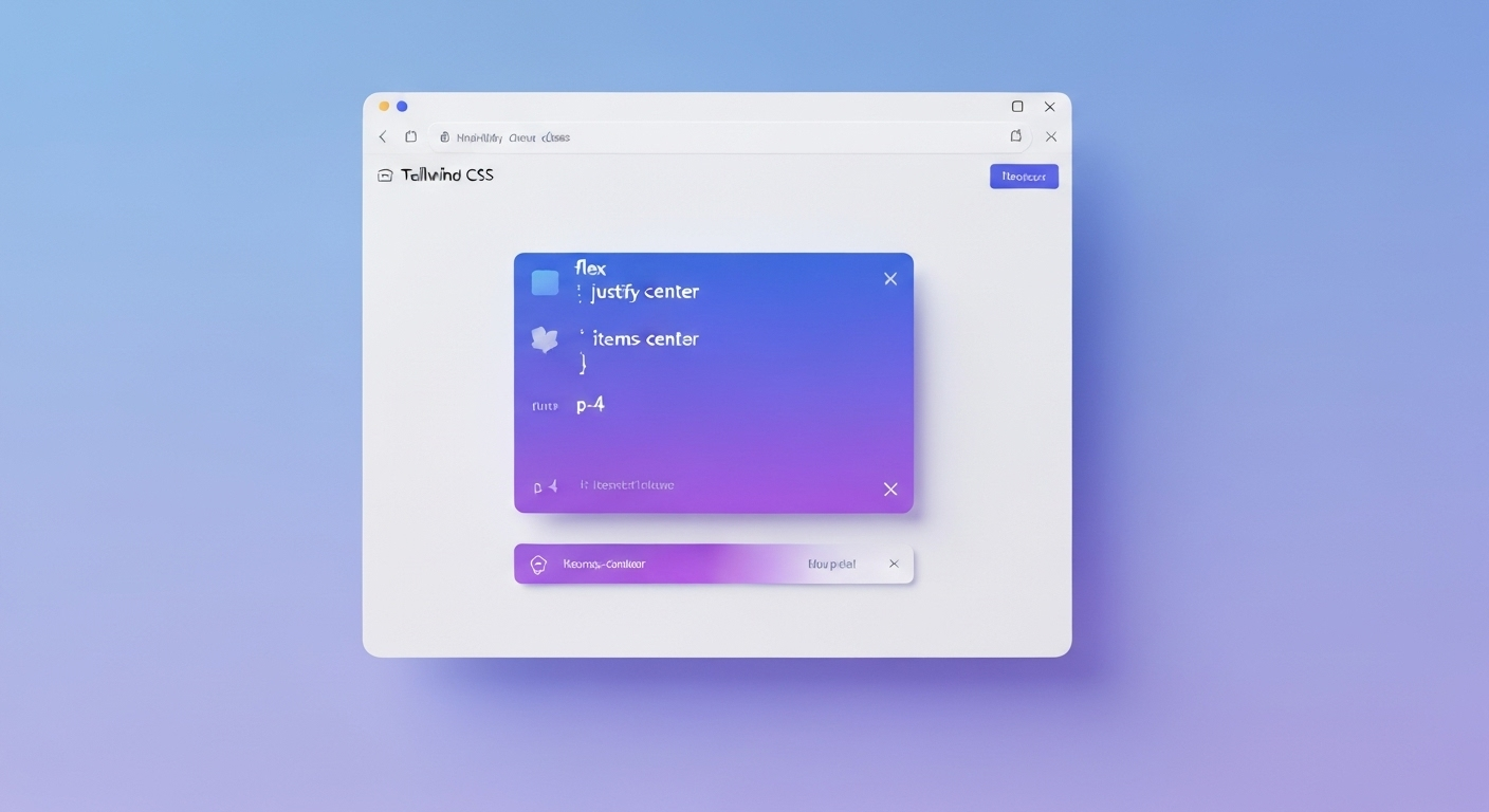
To do this, you apply three classes to the parent container: flex, justify-center, and items-center. The flex class initializes the flex layout. The justify-center class aligns the child items along the main axis (horizontally, by default), and items-center aligns them along the cross axis (vertically).
Here’s a simple example: <div class="flex justify-center items-center h-screen"><div>Centered Content</div></div>. In this code, the parent div is a full-height flex container, and its child div will be perfectly centered, both vertically and horizontally. This is the go-to method for centering elements like modals, pop-ups, or hero content.
Step 4: Using Grid Layout to Center a Div in Tailwind
While Flexbox is excellent for centering, CSS Grid offers an even more concise way to do it in Tailwind. If you need to center a single item within a container, using a grid layout can be incredibly efficient. The magic lies in the place-items-center utility.
To center a div using grid, you apply the grid and place-items-center classes to the parent container. The grid class enables the grid layout, and place-items-center is a shorthand that sets both align-items and justify-items to center. This single class handles both vertical and horizontal centering at once.
For example: <div class="grid place-items-center h-screen"><div>Centered Item</div></div>. Just like with Flexbox, the parent container needs a defined height for vertical centering to work. This method is perfect for centering an element within a specific section, regardless of its width or the dimensions of the parent.
| Feature | Flexbox (flex justify-center items-center) | Grid (grid place-items-center) |
|---|---|---|
| Use Case | Ideal for aligning a series of items in a single row or column. | Excellent for 2D layouts and centering a single item in a cell. |
| Simplicity | Requires two classes (justify-center, items-center) for centering. | Requires only one class (place-items-center) for centering. |
| Control | Offers granular control over main and cross-axis alignment separately. | Centers along both axes simultaneously. |
Tips for Responsive and Accessible Centered Layouts
When you center a div, it’s important to think beyond a single screen size. Effective responsive design ensures your layout looks great on all devices, from small phones to large desktops. Similarly, accessibility is crucial, as your design choices should not create barriers for users with disabilities.
Tailwind’s responsive prefixes (like md: or lg:) are the primary utilities that help you adjust centering for different screen sizes. With these, you can modify your layout at specific breakpoints. We’ll explore how to use them effectively and discuss key accessibility considerations to ensure your centered content is usable by everyone.
Making Centered Divs Responsive Across Devices
A key strength of Tailwind CSS is its mobile-first approach to responsive design. You can easily adjust your layout for different screen sizes by using breakpoint prefixes. For example, you might want content to be centered on small screens but left-aligned on larger ones.
To achieve this, you apply a base utility for mobile and then add prefixed utilities for larger screens. For instance, text-center md:text-left will center text on mobile screens but align it to the left on medium screens and up. This same principle applies to Flexbox and Grid utilities, allowing you to change alignment, direction, or spacing at different breakpoints.
Here are some tips for responsive centering:
- Use
flex-col md:flex-rowto stack elements vertically on mobile and place them in a row on larger screens. - Adjust the width of centered elements with classes like
w-full md:w-1/2to give them more space on larger displays. - Use responsive padding utilities (e.g.,
p-4 md:p-8) to ensure your centered content has adequate breathing room on all devices. - Remember that font size can also be made responsive to maintain visual hierarchy.
Accessibility Considerations When Centering Content
While centering content is primarily a visual choice, it can impact accessibility if not handled with care. The most important rule is to ensure that the visual order of content on the web page matches the source order in your HTML. This is crucial for users who rely on a keyboard or screen readers to navigate.
Flexbox and Grid can change the visual order of elements without altering the DOM order. For example, using flex-row-reverse can be disorienting for screen reader users. Always make sure that the reading and navigation flow remains logical. For interactive elements like buttons and links, centering doesn’t inherently cause issues, but you must ensure they remain easily focusable.
For other elements, remember standard accessibility practices. All images should have a descriptive alt attribute, and all form elements must have associated labels. By keeping the HTML structure semantic and logical, you can create centered layouts that are both beautiful and accessible to all users.
Practical Examples: Centering Common Elements
Theory is great, but seeing it in action is better. Let’s look at some practical examples of how to center a div and other common elements using Tailwind. We’ll apply the techniques we’ve discussed to real-world components like a login form, images, and a button.
These examples will show you how to combine different utilities to build a polished and functional layout. Whether you’re working from a template or building from scratch, these patterns will be incredibly useful in your day-to-day development work.
Centering a Login Form Div
A common requirement is to center a login form in the middle of the page. This is a perfect use case for Tailwind’s Flexbox or Grid utilities. The goal is to place a card-like container, which holds the form elements, in the exact center of the viewport.
To achieve this, you can wrap your form in a div and apply centering classes to a parent container that spans the full height and width of the screen. For example, you can make the <body> or a main wrapper div a flex container.
Here’s how you could do it using Flexbox: <body class="bg-gray-100 flex items-center justify-center min-h-screen"> <div class="bg-white p-8 rounded-lg shadow-md w-96"> <!-- Your form elements go here --> </div> </body>. This code uses Tailwind classes to create a full-height flex container that perfectly centers the login card. It’s a simple, effective, and common template for authentication pages.
Centering Images and Buttons with Tailwind
Centering images and buttons is just as easy with Tailwind. For an image to be centered horizontally within its container, you can treat it as a block-level element and use the mx-auto utility. Simply add the block and mx-auto classes to your <img> tag.
For example: <img src="..." alt="A descriptive alt text" class="block mx-auto w-1/2">. The block class ensures the image behaves like a div, allowing mx-auto to work. Remember to always include a meaningful alt attribute for accessibility.
To center a button, you have a couple of options. If the button is the only element in a div, you can apply text-center to the parent div. Alternatively, if you want more control, you can use Flexbox. For instance: <div class="flex justify-center"><button class="bg-blue-500 text-white py-2 px-4 rounded">Click Me</button></div>. This is particularly useful when you need to align multiple buttons or elements in a row.
Troubleshooting Centering Issues in Tailwind CSS
Even with Tailwind‘s simple utilities, you might occasionally find that your attempt to center a div doesn’t work as expected. Troubleshooting these issues is usually a matter of checking for a few common mistakes in your layout or HTML structure.
Often, the problem isn’t with Tailwind itself but with the containing elements or a missing prerequisite class. Don’t worry—these issues are typically easy to fix once you know what to look for. Let’s go over some common pitfalls and how to verify your container settings.
Common Mistakes and How to Fix Them
When your centering code doesn’t work, it’s often due to one of a few common mistakes. Understanding these pitfalls will help you quickly fix your layout and get back on track. One of the most frequent errors is forgetting to enable the proper display property on the parent container.
For example, items-center and justify-center have no effect if the parent element doesn’t have the flex or grid class. Another common issue is trying to vertically center an element inside a container that has no defined height. The browser can’t center something if it doesn’t know the vertical bounds.
Here are some typical errors and their solutions:
- Mistake: Using
justify-centerwithoutflexon the parent. Fix: Always addflexorgridto the parent container when using alignment utilities. - Mistake: Using
mx-autoon an element that is full-width. Fix: Make sure the element has a defined width (e.g.,w-1/2ormax-w-md) so there is space to center it in. - Mistake: Vertical centering not working. Fix: Ensure the parent container has a height (e.g.,
h-screenorh-64). - Mistake: Conflicting styles from the base HTML structure. Fix: Use browser dev tools to inspect the element and check for inherited styles that might override your utilities.
Verifying Parent and Child Container Settings
If you’ve checked for common mistakes and your layout still isn’t right, the next step is to inspect the parent container and its children. The relationship between the child and parent is key to successful centering. The best tool for this job is your browser’s built-in developer tools.
Right-click on the element you’re trying to center and select “Inspect.” This will open a panel showing you the HTML elements and the CSS being applied to them. You can hover over the parent container in the inspector to see its actual dimensions. Often, you’ll discover that the parent isn’t as tall or as wide as you thought.
Check the ‘Computed’ tab in the dev tools to see the final box model values, including margin, border, and padding. This can reveal if unexpected spacing is pushing your element out of alignment. Verifying that the parent has the space and the correct display properties (flex or grid) is essential to diagnosing why your child element isn’t centering correctly.
Conclusion
In summary, centering a div in Tailwind CSS is essential for creating visually appealing and user-friendly web designs. By utilizing the various utilities provided by Tailwind, you can master the art of centering both horizontally and vertically with ease. Remember to consider responsiveness and accessibility to ensure your designs cater to all users. With the step-by-step guide and practical examples outlined in this blog, you’re well-equipped to tackle any centering challenge that comes your way. So why wait? Dive into your Tailwind CSS project today and bring your designs to life! If you’d like to learn more or need personalized assistance, don’t hesitate to reach out for a free consultation.
Frequently Asked Questions
Can I center a div using Tailwind without extra CSS?
Yes, absolutely. You can center a div using only Tailwind utility classes without writing any custom CSS. Utilities for Flexbox (flex, justify-center, items-center) and CSS Grid (grid, place-items-center) handle all the logic for you directly within your HTML elements.
Which Tailwind utilities are best for centering items?
The best Tailwind utilities for centering items are the Flexbox and Grid classes. For centering in both directions, flex items-center justify-center is the most common Flexbox approach, while grid place-items-center is a very concise and powerful Grid alternative. Both are excellent choices.
How does responsive design affect centering in Tailwind?
Responsive design in Tailwind allows you to change how you center elements on different screen sizes. By using breakpoint prefixes like md: or lg:, you can apply centering utilities conditionally, creating a flexible layout that adapts perfectly to both mobile and desktop views.
Does centering a div impact accessibility?
Centering a div can impact accessibility if the visual order of the layout doesn’t match the DOM order of the HTML elements. This can confuse users of screen readers. Always ensure your content flows logically to provide an inclusive experience for everyone.
https://developer.mozilla.org/en-US/docs/Web/CSS/max
https://developer.mozilla.org/en-US/docs/Learn_web_development/Core/Styling_basics/Values_and_units