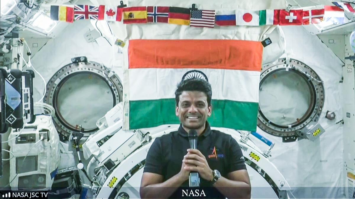
Speaking from the unique vantage point of space, astronaut Rakesh Shukla offered a striking perspective on India during his recent chat with Prime Minister Modi. Shukla described how borders disappear when you look down from orbit, making India appear even bigger than shown on traditional maps.
His comments highlight a powerful truth: from above, divisions fade away, and the country’s presence stands strong. This rare viewpoint invites us to rethink how we see national borders and our place on the planet. For leaders and citizens alike, these words remind us of a shared responsibility that stretches far beyond the lines drawn on a map.
Astronaut Sunita Williams and Rakesh Shukla’s Observations from Space
From hundreds of kilometers above the Earth, astronauts see a world that most people can only imagine. For both Rakesh Shukla and Sunita Williams, the experience of looking down from the International Space Station brings a fresh perspective on familiar places like India and the meaning of borders.
Rakesh Shukla: Borders Vanish, India Expands
Rakesh Shukla’s remarks to Prime Minister Modi struck a chord with people everywhere. He described how India, when viewed from space, appears much larger than its map outlines suggest. The absence of visible borders lets the land speak for itself, making every region look connected.
- No political lines: Shukla noted, “No borders can be seen from up here.” Rivers, deserts and mountains create the real lines, and countries seem to flow into one another.
- A sense of unity: The sprawling patchwork of colors and terrains makes India’s presence stand out in a way maps never capture. It feels like one continuous, living landscape instead of divided states.
- Emotional impact: Shukla’s words remind many of the difference between what’s drawn on a page and what truly exists on the ground. The view shifts your sense of the country’s scale and wholeness.
Sunita Williams: Echoing the Experience
Astronaut Sunita Williams, who has spent extensive time aboard the International Space Station, shared similar thoughts in her previous missions. Her observations add weight to Shukla’s statements and highlight the shared experience among astronauts.
- Shared astronaut wisdom: Williams expressed how, from orbit, countries lose their sharp separations and the planet feels borderless.
- Connected on a global scale: Having roots in India, Williams often looked for Indian cities from the ISS. She described how seeing India from above brought a powerful feeling of connection, both to her heritage and the rest of Earth.
- Universal message: Both astronauts reinforce the idea that borders are concepts created by people. From their high vantage point, what matters is the health and unity of the land below.
How Space Changes Our View of Borders
Seeing Earth from above can transform the way we think about countries, identities and even conflicts.
- Reality vs. representation: Maps and globes draw sharp lines, but these are invisible from space. The physical size and presence of a country like India feel far greater and less limited.
- A fresh perspective: Space travelers find it easier to see humanity’s shared home. The view prompts reflection on the true meaning of divisions and encourages global togetherness.
- Inspiration for the future: These observations offer hope that, by looking beyond borders, people can work together to care for the planet.
The shared stories of Sunita Williams and Rakesh Shukla spark curiosity and pride. They ask us to look at our home from a wider lens, seeing unity where we once saw only separation.
How Maps Distort Reality: India’s True Geographical Scale
Maps shape the way we picture countries. Most people trust the map in their textbook or on their phone without a second thought. But the reality is, the way we draw the world on flat paper or screens can stretch or squeeze countries in strange ways—changes that become clear the moment you compare a globe, a flat map, and a satellite photo. India, in particular, often appears smaller than it really is because of these hidden distortions.
Why Map Projections Cause Distortion
When you try to turn the round Earth into a flat map, something always gets warped. This is a basic map problem. Mapmakers use different projection methods to deal with this, and each one changes the size, shape, or position of countries.
The most famous example is the Mercator projection, the classic map used by most schools and online platforms:
- The Mercator map was made for sailors, not classrooms. It helps with navigation but greatly inflates things near the north and south poles.
- For example, Greenland looks about the same size as Africa on a Mercator map, but Africa is actually over 14 times larger.
- Countries near the equator, like India, end up looking much smaller than they really are.
Another popular projection is the Robinson projection, designed to make the entire map look more realistic:
- The Robinson map bends lines to give more balanced shapes, but it still stretches and squeezes land at the edges.
- India’s outline looks a bit more accurate on the Robinson map, but some shrinking and stretching still happen.
Why does this matter for India?
- India’s vastness gets underestimated when shown on most maps. It’s usually drawn smaller than Canada or Russia, even though those countries only look bigger because their land is stretched across the top of flat maps.
- When astronauts say India “looks much larger from space,” they are seeing it without map distortion.
Comparing India’s Size on Maps Versus Satellite Images
There’s no replacement for seeing the world as it really is—like with a satellite photo from space.
Let’s break down how India’s size compares across different ways of seeing the world:
- On most classroom maps (Mercator): India looks much smaller than Russia, Canada, or even the United States. It’s shown as a long triangle, often squeezed between Africa and Southeast Asia.
- On a globe: India appears larger, more central, and its proportions match the reality astronauts see.
- Satellite images from space: India dominates the Indian subcontinent. The borders fade, and the entire sweep of land—rivers, mountains and deserts—show just how vast the country is.
Here’s a quick side-by-side for clarity:
| View | India’s Relative Size | Notable Changes |
|---|---|---|
| Mercator map | Shrunk, narrow | Looks smaller than true |
| Robinson map | Slightly compressed | Closer to real shape |
| Globe/Satellite | Matches reality | Shows full extent |
What’s the takeaway?
Maps are tools, not mirrors. The way India appears on most of them is only part of the story. By comparing projection maps with images from space, anyone can see how much our usual maps can shrink, compress or change the country’s true scale. The view from space—described by astronauts like Shukla—reminds us not to take every border or shape at face value. The reality of India’s size and connectedness is much greater than many maps suggest.